Pre-made styles
Making a study look neat is helpful in several ways: A clear design helps participants navigate through the study, and it shows the professionalism of its creators. There are, of course, many ways to achieve this, and if you have built web-based experiments before, you might well have a preferred layout that is tested and proven.
With lab.js, we’ve included a basic set of styles with the starter kit.
These are provided to get you started quickly, and to save you some hassle when
you’re building your first experiment. The following section describes the
styles that are available, and shows you how to apply them.
Important
You are in no way bound to the styles provided in the starterkit and described here – you’re very welcome to replace them, or extend and adapt them to your needs: These styles are designed to give users a head start, and are in no way mandatory.
If you notice something that’s missing or should be working differently, please let us know – we’re really happy to extend the built-in styles, and to make them more useful.
Contents
Including the styles
Note
If you’re working from the starter kit, the default styles have already been set up for you – you’re good to go, and ready to set up your page!
If you’ve been working on an existing study and would like to use the styles,
please download the latest starter kit and include the file lib/lab.css
in your project. You’ll also need to include a link tag in the head section
of your document, with a reference to the file:
<link rel="stylesheet" href="lib/lab.css">
You might need to adjust the path in the href attribute depending on the
placement of the downloaded style sheet file.
Setting up the page
Container
On the most coarse level, all content on the page is gathered inside a
container. This element holds all of the content and determines its width.
In the default style, it provides a thin outer border for the content. You can
create a container by applying the container class to a div or another
block element:
<!doctype html>
<html>
<head>
  <meta charset="utf-8">
  <title>Example Experiment</title>
  <!-- Load styles -->
  <link rel="stylesheet" href="lib/lab.css">
  <!-- Load additional styles and scripts -->
</head>
<body>
  <!-- Define the container -->
  <div class="container">
    <!-- Container content -->
  </div>
</body>
</html>
Page sections
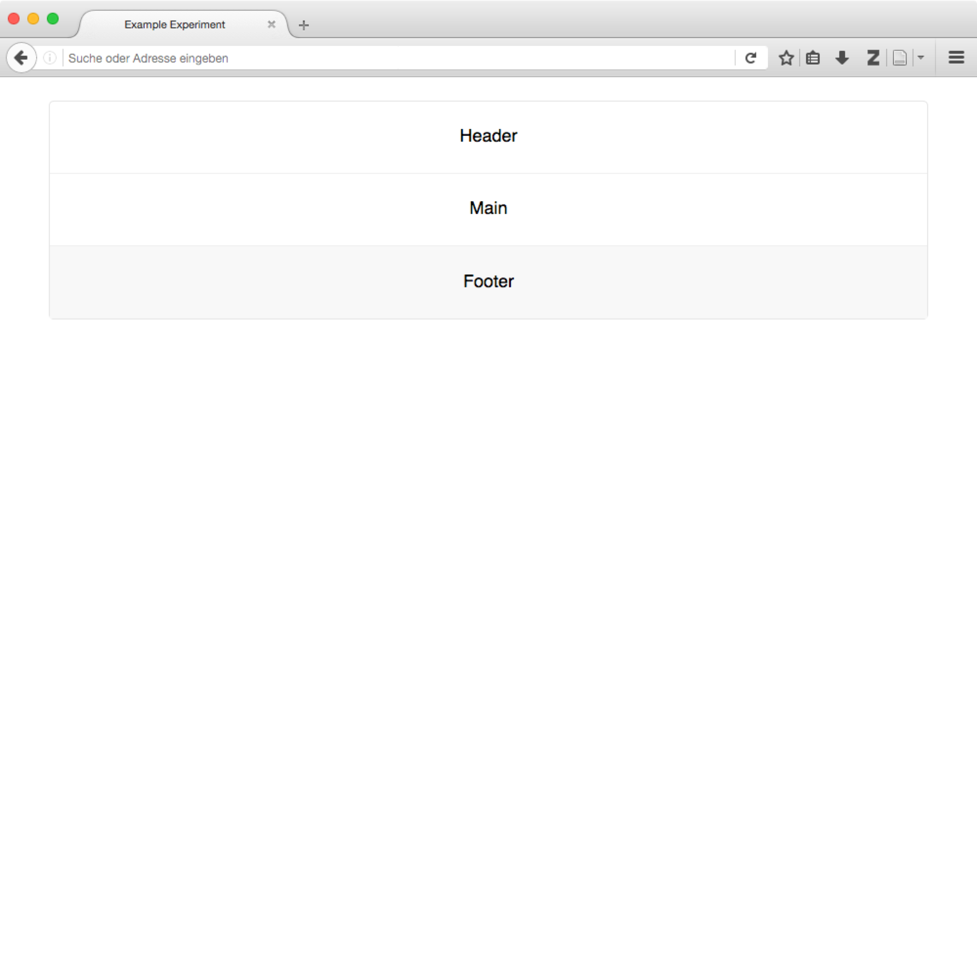
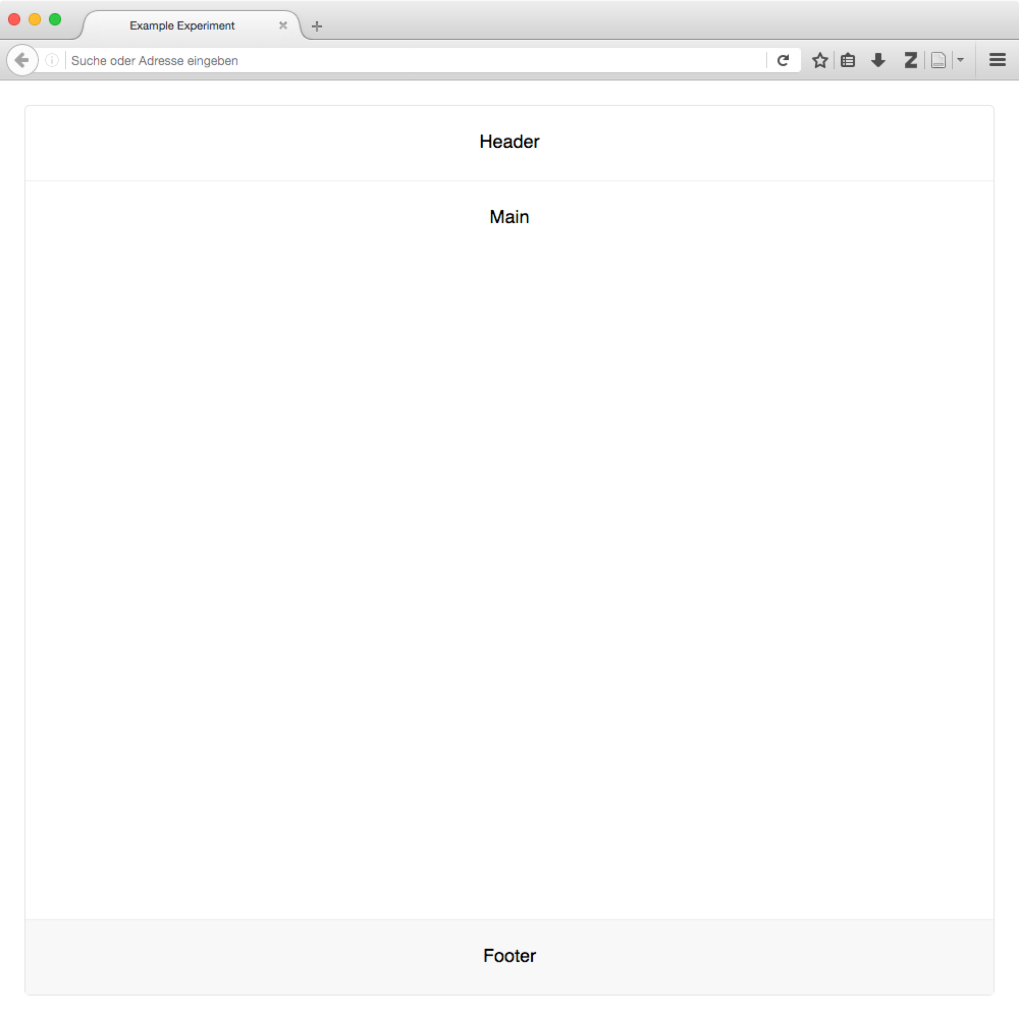
You’ll often want to subdivide the page into different sections containing different parts of the visible information. For example, you might want to include a header with your university’s logo, a footer with contact info or navigation buttons, and of course the main experiment content.
You can achieve this directly by placing header, main and footer
elements within the container:
<!doctype html>
<html>
<head>
  <meta charset="utf-8">
  <title>Example Experiment</title>
  <link rel="stylesheet" href="lib/lab.css">
</head>
<body>
  <div class="container">

    <header>
      Header
    </header>

    <main>
      Main
    </main>

    <footer>
      Footer
    </footer>

  </div>
</body>
</html>
Fullscreen styles
By adding the fullscreen class to the container element, you can make it
expand to fill the entire width and height of the browser window.
Of course, any sections included in the container are positioned accordingly.
Text styles
The bulk of a study’s content will often be pure text. HTML provides many
tags for text markup (such as headings, paragraphs, lists, etc.) out of the box,
and the stylesheet provides matching settings for many, even some exotic tags
like the keyboard button <kbd>key</kbd>.
However, sometimes tags alone are not sufficient, and therefore we have added some helper classes to provide frequently used layout adjustments.
Alignment
The text-left, text-center and text-right classes align text to
the left, center and right of its containing block.
Helper classes
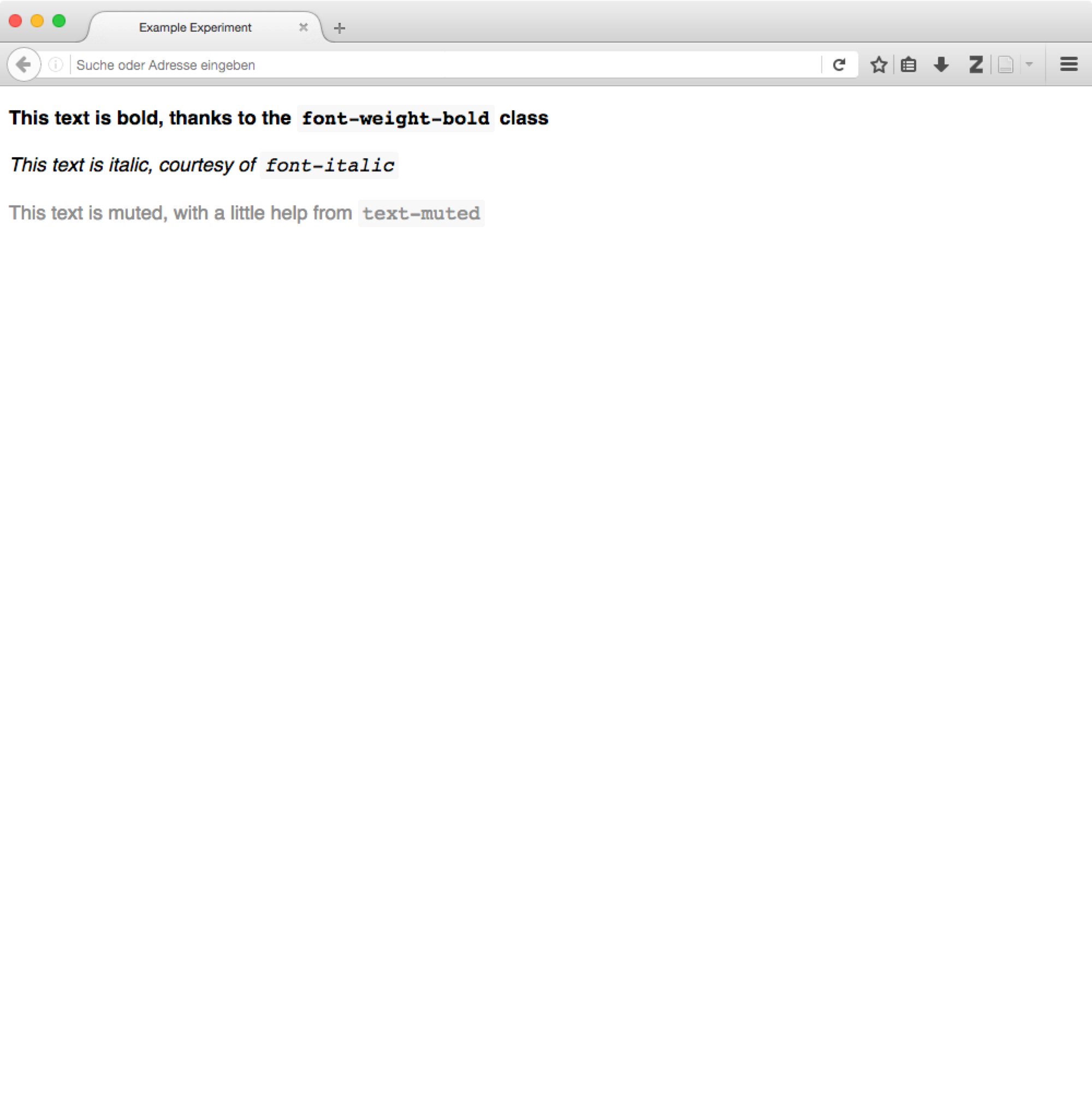
The font-weight-bold and font-italic classes change the formatting of
an element’s text content.
Contextual formatting
Like the alerts shown above, there is often the need to mark text as secondary.
The text-muted class achieves, applied to an element, will color its content
in gray.
Styling content
Beyond styles for regular text, we’ve tried to include CSS classes for purposes that we often use, and which we hope will come in handy in may studies. These are described in the following.
Alerts
Alerts help you highlight information that should not go unnoticed.
The basic alert class, applied to a <div> tag, will emphasize its
content by placing it on a grey background. Adding the alert-warning or
alert-danger class will change the color to yellow and red for drawing
further attention.
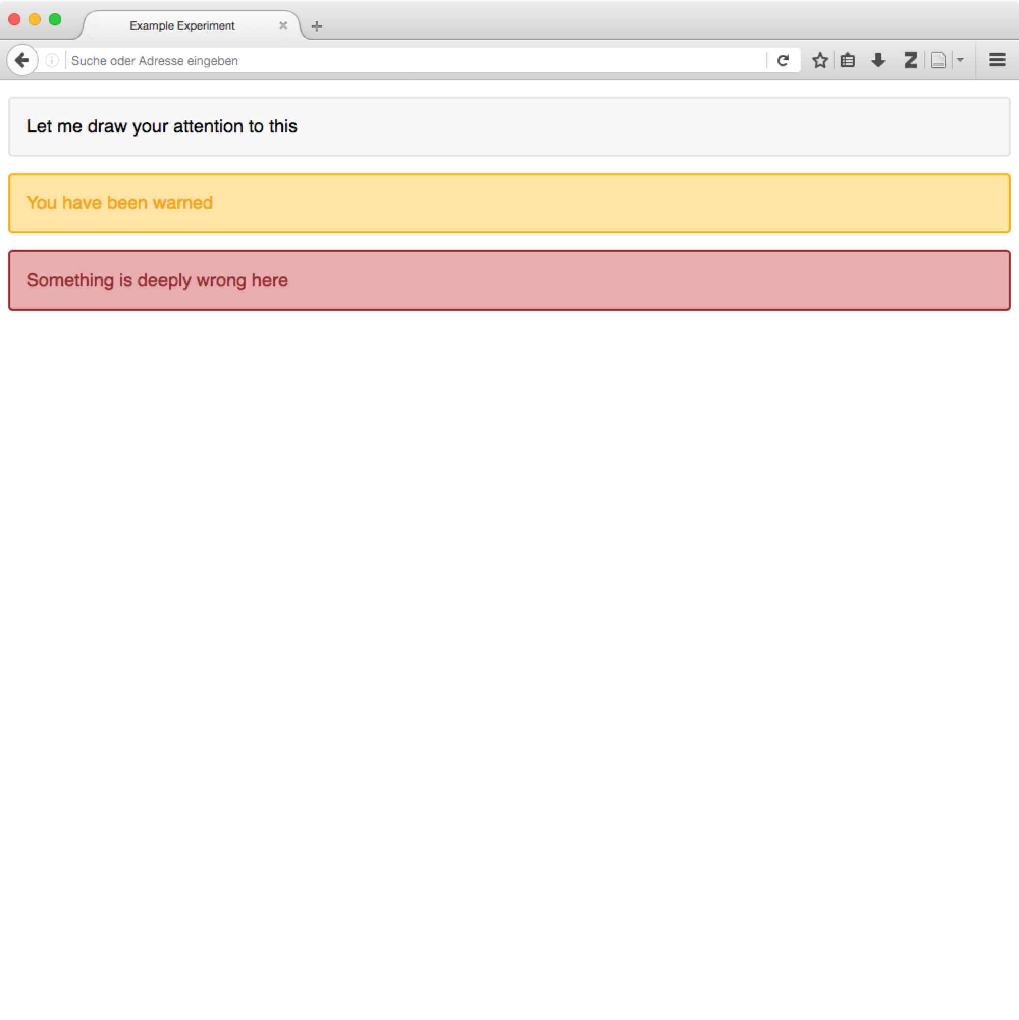
<div class="alert">
  Let me draw your attention to this
</div>

<div class="alert alert-warning">
  You have been warned
</div>

<div class="alert alert-danger">
  Something is deeply wrong here
</div>
Tables
The default stylesheet adds horizontal dividers between the rows of tables
(this deviates from the bootstrap defaults, which require the table class
for styling). Adding the table-striped class to the table adds striped rows.
Any additional styles can be removed by adding the table-plain class to the
table.
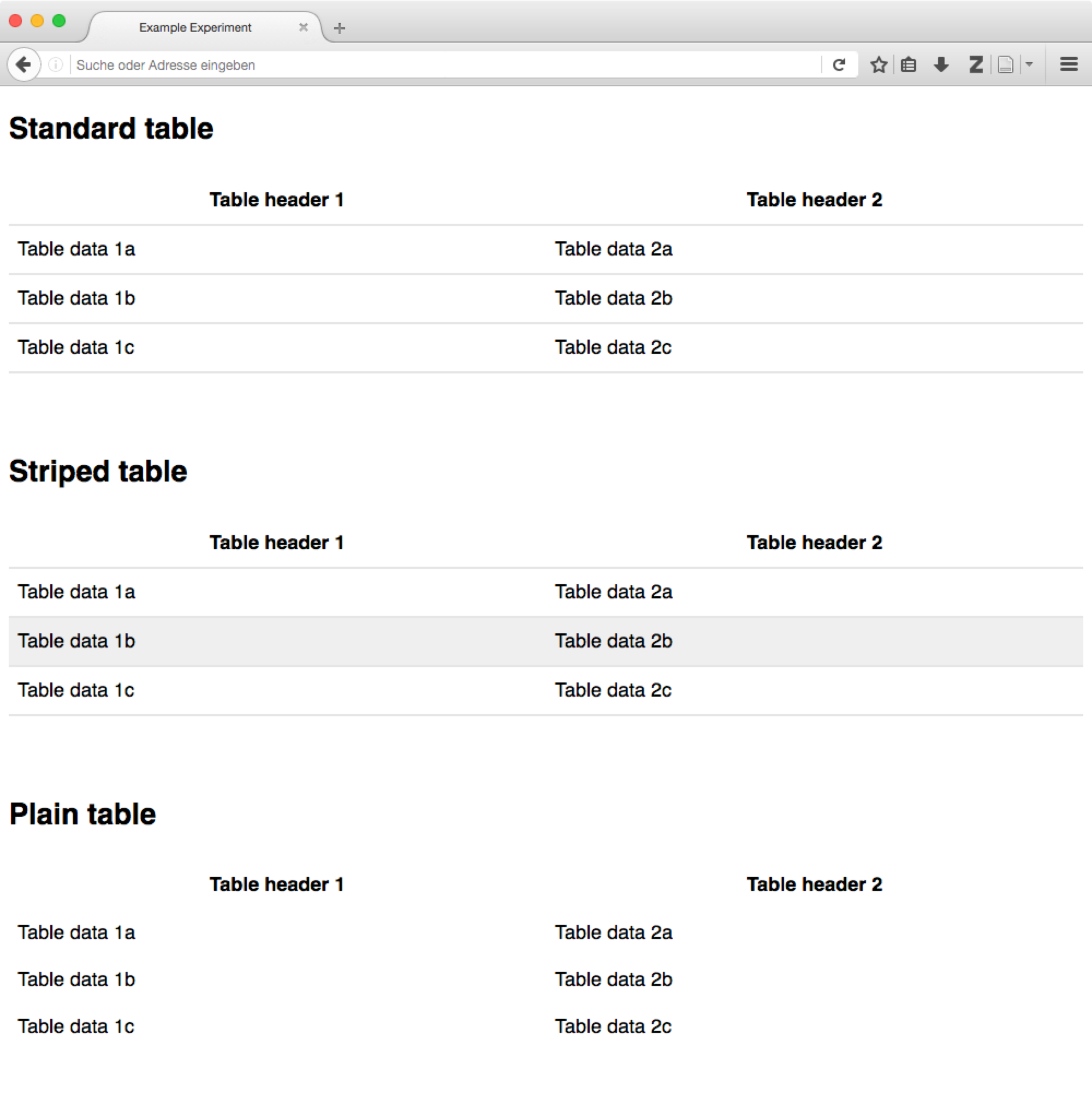
<table>
  <tr>
    <th>Table header 1</th>
    <th>Table header 2</th>
  </tr>
  <tr>
    <td>Table data 1a</td>
    <td>Table data 2a</td>
  </tr>
  <tr>
    <td>Table data 1b</td>
    <td>Table data 2b</td>
  </tr>
</table>
Positioning things
Alignment of block elements
The most common challenge encountered in building an experiment is the alignment of stimuli and other content. By default, content will be positioned in the top left of its containing element, but this need not always be the case.
The content-vertical-center, content-horizontal-center and
content-horizontal-right classes place a single element in the vertical
center of it surrounding element, and, independently, in the horizontal center
and at the right border. Both sets of classes can be used in conjunction.
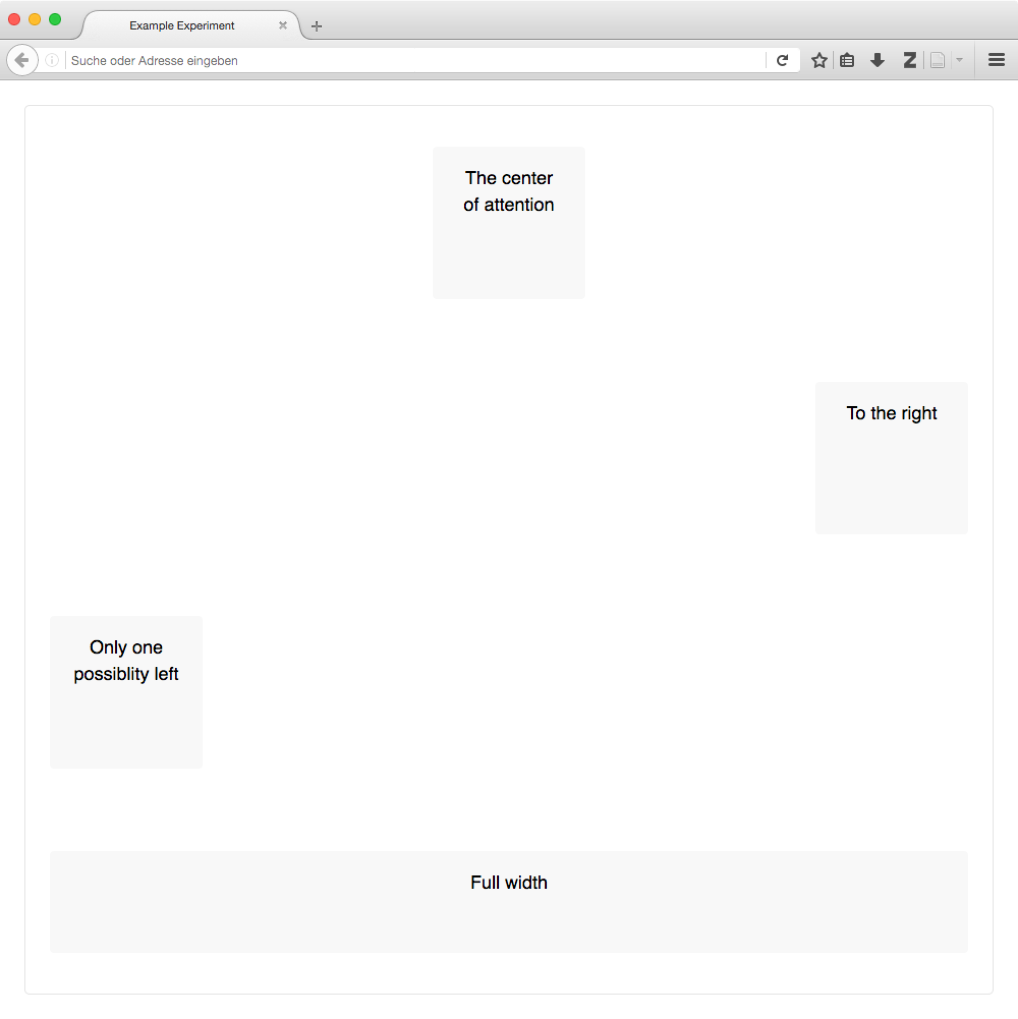
Block alignment examples
Note how the classes are applied to the surrounding elements, and not directly to the elements which whose position is changed.
Also, only the directly nested elements are aligned; their content must be positioned independently.
<div class="container">
  <main class="content-horizontal-center
               content-vertical-center">
    <div>
      The center of attention
    </div>
  </main>

  <main class="content-horizontal-right
               content-vertical-center">
    <div style="width: 100px">
      To the right
    </div>
  </main>

  <main class="content-vertical-center">
    <div>
      Only one possibility left
    </div>
  </main>

  <main class="content-vertical-center">
    <div class="w-100">
      Full width
    </div>
  </main>
</div>
Element visibility
The invisible class hides an element from view, but still includes it in
the layout. Thereby, an empty space remains where the element would otherwise
have been rendered.
The hidden class excludes an element from rendering, meaning that it will
not affect the page display in any way.
The hide-if-empty class removes an element from the page if it does not
contain content.
Beyond the default styles
The default styles presented above are designed to be neutral and as widely applicable as possible. That very fact, however, makes them slightly boring.
If you like, you can do away with the default styles entirely. Nothing in the Javascript library dictates what your study should look like – it will happily exchange and display content regardless of structure of the page and the styles applied.
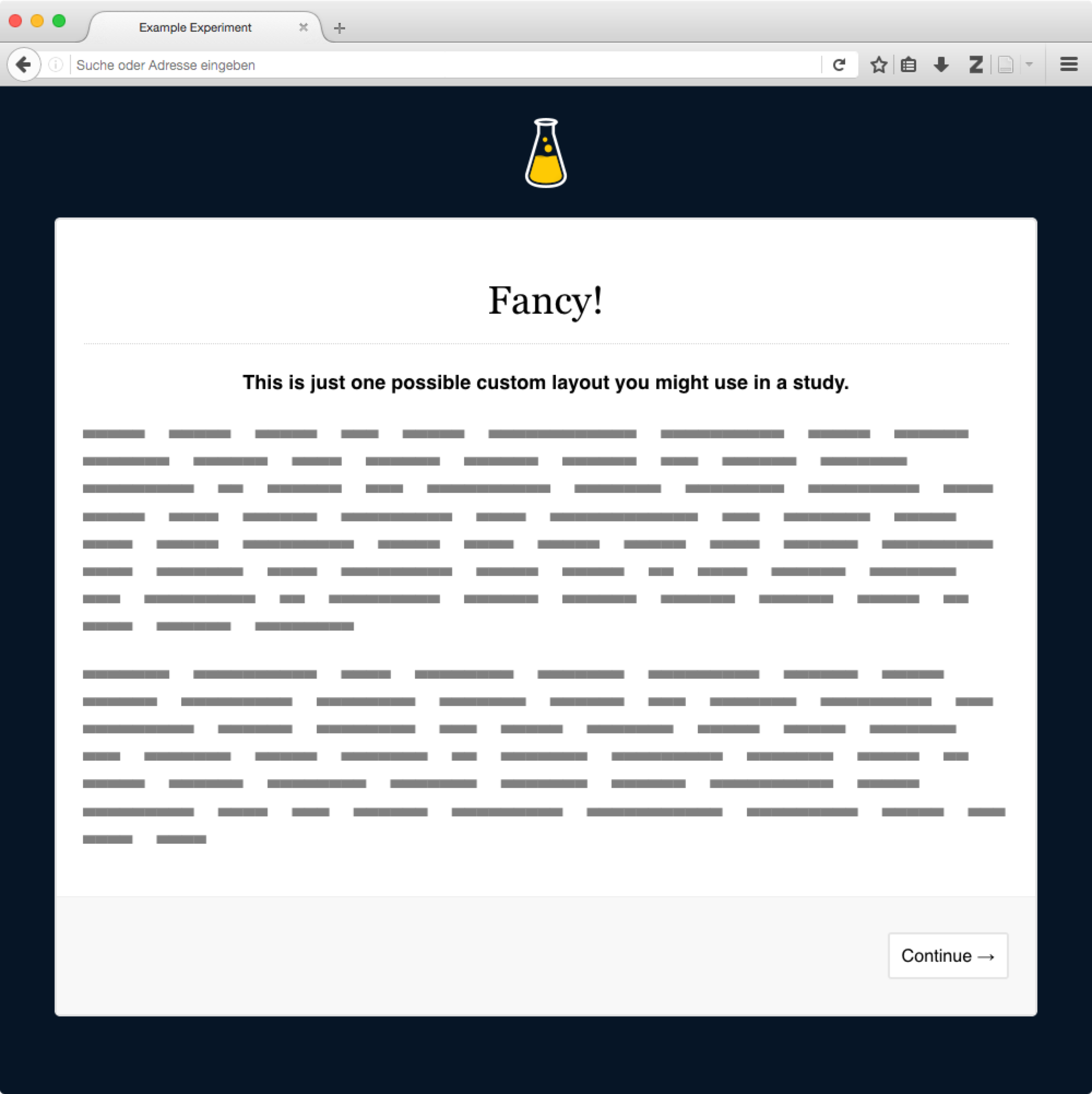
Alternatively, you can extend the default styles [1]. We often include a second stylesheet in the page header, which contains some a few rules that supplement and overwrite the defaults. In the screenshot on the right, the fonts have been changed slightly, and a dash of color added. Here’s what the additional style sheet looked like:
/* Add a dark page background,
   and highlight the content */
body {
  background-color: rgb(6, 21, 38);
}
div.container {
  background-color: white;
  border-width: 2px;
}
/* Use a serif font for the headers,
   and add a bottom border to h1 elements */
h1, h2, h3 {
  font-family: "Georgia", serif;
  font-weight: normal;
}
h1 {
  text-align: center;
  border-bottom: 1px dotted lightgray;
  padding-bottom: 0.8rem;
}
See also
Many of the selectors used here correspond (on purpose) to those used in the Bootstrap framework, which provides far more comprehensive styles for many more applications.
To a large degree, the supplied styles are a simplified subset and facsimile of bootstrap’s many and beautiful styles. Please check them out if you find the included stylesheet lacking – because the class names are, where possible, identical, switching should not be to big an effort.
There are several more such frameworks that cater to different tastes and programming styles, for example Semantic UI or Material Design.
| [1] | You could, of course, also modify the stylesheet directly if you like. We caution against this approach, because you’ll loose the ability to update the default library stylesheet independently of your modifications. By overwriting the defaults explicitly, it will be easier to see exactly which adjustments you’ve made. |